

TeeIsland Redesign
Random Article
TeeIsland Redesign
We have just completed a redesign of TeeIsland. It’s a simple redesign that focusses on user experience (UX), enhanced responsive design, and speed.

Above the fold, the homepage consists of a large slider (which we may revert to a large CTA instead in the coming weeks) made up of simple images with simple CTAs.
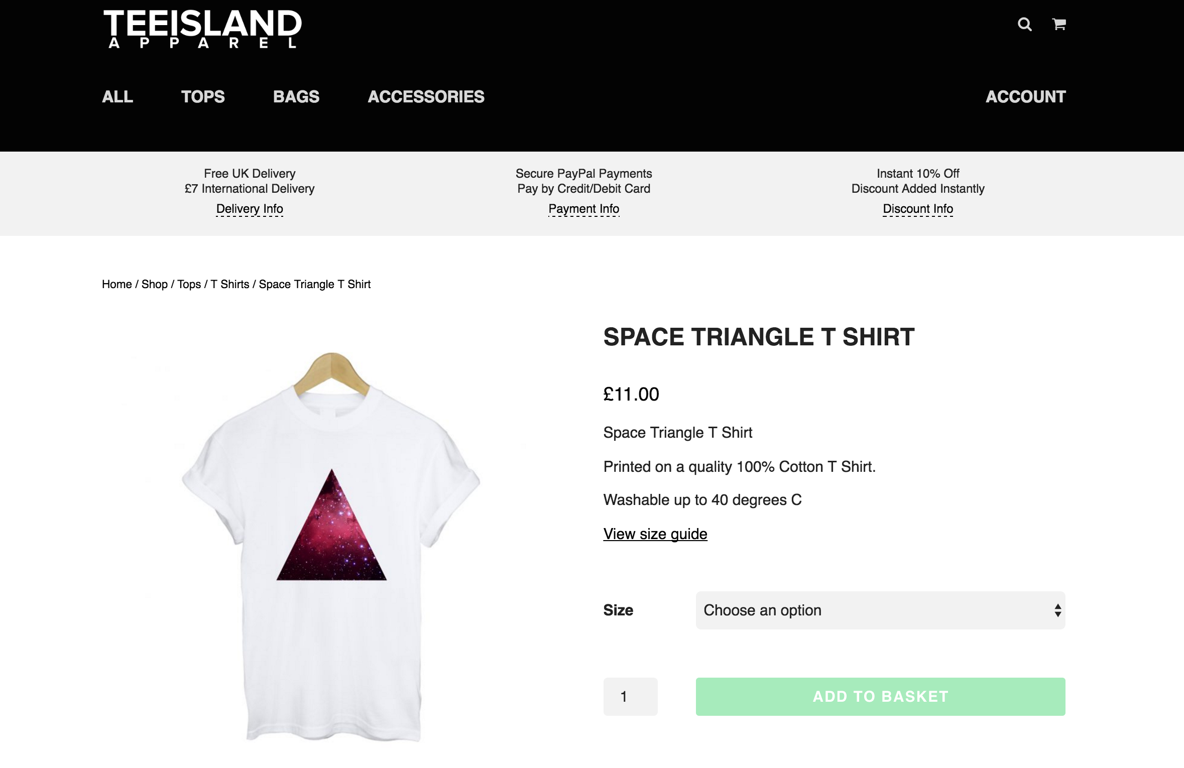
The single product pages have been kept simple and user-friendly. With an info band running across the top of the page below the header – with the hope that this increases conversions.
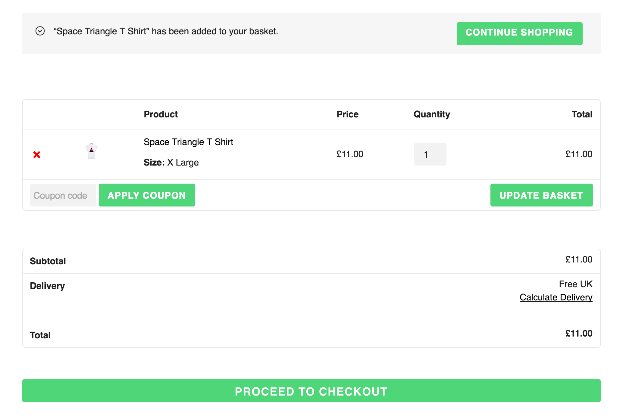
The cart is now mobile friendly and we should see a boost on mobile / tablet conversions from an enhanced design for smaller screen sizes. Note the large green buttons that are hard to miss.
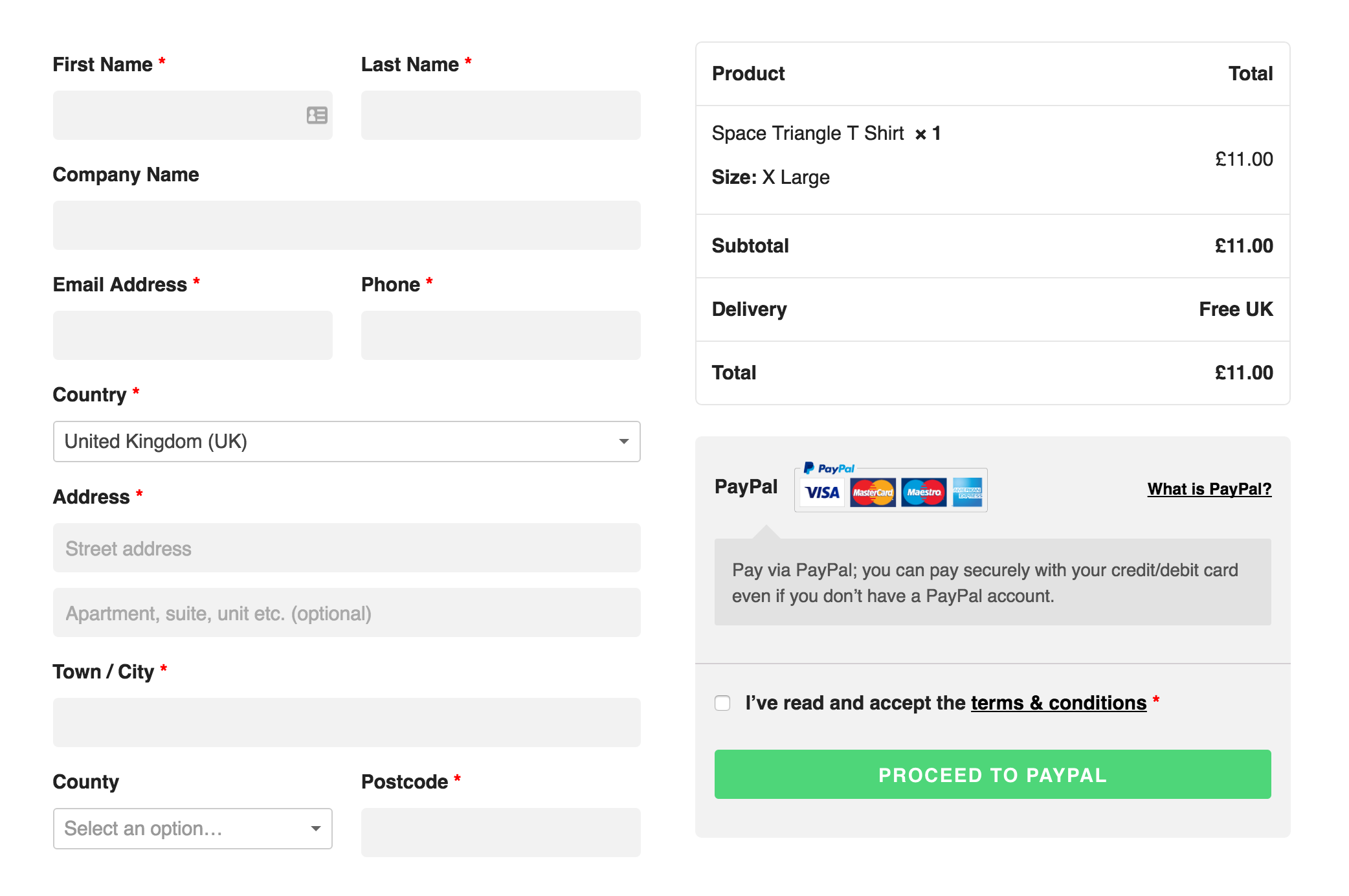
The checkout page has been streamlined, kept clean, and the design on smaller screen sizes has been enhanced.
As with all projects undertaken by Codesauce these are continuing works in progress where we monitor what is working well and what can be improved.


Comments
Take part in the discussion
Discussion about TeeIsland Redesign article, if you have any questions, comments or thoughts then get leave a reply.